Hello,
I have trouble making out the TH curve from both the R (in some cases) and the NT blend (in other cases).
1/Is there a noticeable size difference that helps distinguishing the right TH curve from the ND blend? I assumed the latter was larger, but my manual doesn’t seem to differentiate them much, size-wise. For example: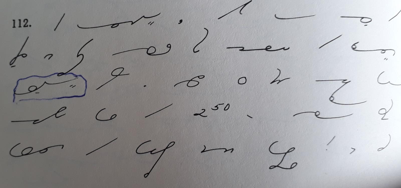
I took me a while to decypher the boxed outline as “royal”, I was wondering what R-OI-NT/D-L could possibly stand for.
2/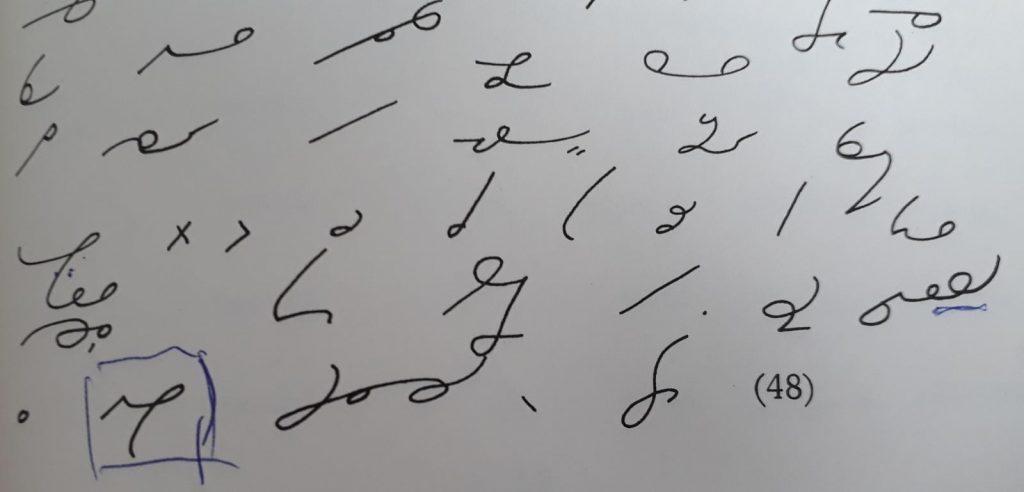
Here I was confused about the underline word, attrayante. The Y really looks like an R to me, because it dips down before going up, just like the R that precedes it. So what is it that makes it obvious it’s Y and not R (aside from guessing from the context of course)?
3/
I have the same problem here, I ended up guessing it was “tenté” but what tells me it’s not “tardé” ? Again what is supposed to be a horizontal N dips like an R before going up. So I’m confused.
Thanks for your help.
Hello Aymeric,
1) Yes, there’s a different of size… normally. I would have read also “nt/nd” in your example. In “Études Graduées…”, it’s just “RAL” for royal… probably it is derivated from “roi” (RA);
2) It looks more like a “R” to me than anything else: the ending of the curve is at the same height as the beginning. In “Sénécal”, “attrayant” is just “ATRE-dot”. (To my surprise, the verb “attrayer” exists…)
3) This example, I don’t understand. I know, in this case, Sénécal is very different… There’s never “r” and then, following “t” but seldom, it’s very rare, “l” following by “t” like “culture” or “sculpture”. In this case, the curve is broken, there’s a clear distinction between the two sounds…
Yes, attrayer is a verb. Or at least, it is in Ontario:
Actually… it's "attraire".
It's not more in use in France except in "attrayant"…
(I don't want at all to "attraire les ours"…)
I was being facetious … 🙂
And I was ignorant… 🙂
Isn't the imperative 'attrayez', not 'attrayé', which is a past participle?
Yes, it's true. I didn't want to appear pedantic by saying it.
Well, too late…
🙂
Merci Christine. So I'll try to keep that size difference between ILL and NT when I copy those texts.
But can you confirm that when writing the NT/ND blend, you do not curve down the beginning of your stroke as yo would for R? It just goes right and upwards, correct?
Thank you.
I don't see any examples where the NT/ND curves down at the beginning…I mean it could be a little bit but it's not significant. The main difference is the asymmetry of the NT/ND compared to the R, in my opinion… though.
🙂
For right th and nd, they are exactly the same stroke, differing in size. They start to the right and swing up immediately (they should not curl either at the beginning or at the end of the stroke. The red line here is the line of writing and the dotted line is the slant.
In the case of rd and ld, the r and the l maintain their shape and is continued upward at the finish. The r and the l should not be extended too soon, if not, it will look like an nd. The dotted line represents the point in which the stroke should be extended:
This is one of the problems with the rd stroke: you have to have very good penmanship to make sure that it is not confused with th or nd.
I add a bit of a curl to the end of RD. Not enough to look like a hook, just a bit past vertical.
(I vaguely remember that in Anni you can make a O hook by going counterclockwise up and to the left after a straight line. Is my memory playing tricks on me?)
What is the writing in the rest of the book like? Some writers put a bit of a dip when there shouldn't be one, and then a much larger one where there should be, or a slight downward slant to N and then a much larger one for ING. (And some, like me, are inconsistent and really need to do those penmanship drills.)
Thank you Carlos, those images are very useful! I wish you'd have drawn an R or an L next to the TH and NT, so I could see the size relationship. I suppose TH is about as long as an R, and NT as long as an L?
CricketB, this might just be my frustration talking (as if it wasn't already hard enough to learn Gregg!!!) but to me the book is full of such examples of weird proportions, so much so that when I rewrite the texts in my own notebook I almost feel like I'm correcting my textbook.
I swear some plate writers don't know the theory, they're just tidying and copying something someone else wrote.
Forkner and Pittman books are the opposite.
The plates in my second year Forkner book look like the writer couldn't write fast. There are lots of places a slightly different shape would be much faster and still readable. (Forkner is much less sensitive to small changes than Gregg.) If not for my experience with Gregg, I'd think that was the only way that worked.
Pittman texts are the same. They're so precise they must have been done by a machine. I read an article comparing a passage at I think 100 wpm written by four different Pittman teachers. Some wrote clearly and effortlessly. They weren't nearly as precise as the text but I easily could identify each letter. Others obviously struggled. (Glad I wasn't in their class!) I didn't stick with Pittman because too many rules felt arbitrary, and there's a circle within a hook that most of my pens won't do. (I blame the pens, not my lack of practice.)
Some writers have enough experience they know what they can get away with. I can make this P a bit long because there is no word with B, or at least none that makes sense in this context. I'll make this S a bit longer or a bit shallower to fit better between two A's.
There are many samples on this site from very high speed writers. Some were written for the article, so probably a bit neater than than they usually write, with no personal short cuts. There's a lot of variation between them.
I thought I understood the nt blend. I thought of it as n–t with the angle between the n and the t rounded off. So the nt blend stroke starts rightward, just like the n. It all seemed so simple. And then, along came paint. I wrote it with the circle on the outside. Given that circles go outside angles, and the p stroke makes an angle with the n stroke (heck, it even makes an angle with the ngk stroke, e.g. pink), the p stroke obviously makes an angle with the nt blend. Alas, I got it wrong. Why does the circle go inside in the case of paint?
I can't seem to find the combination p-(nt blend) or b-(nt blend) to see exactly how the p/b joins to the nt blend. It appears to be avoided. Pound is p–n and bound is b–n even though sound is s-(nt blend). Bunt and punt are not in the dictionary. Bunting is in the pre-anniversary dictionary but the t goes with the second syllable in that one so it is written b–n–t–dot. As for seeing how an m or an n joins directly with the nt blend, mound is an interesting one. It is written with a jog (suggesting that the m lines up directly with the nd blend) in the pre-anniversary dictionary, but in later dictionaries it is written as (mn blend)-d.
There are no words that are written purely as p/b-nt blend, because the pend blend was created to simplify the writing of the combination. This is the blend use in "carpenter" and "spend." Words like "bend", "expand", and "paint" use the same blend for the same reason, but they add the vowel for legibility.
"Bunt" and "punt" are written without the blend. Since these words follow the omission of short u rule, if we use the blend they would not be legible enough. So they are written b-n-t and p-n-t, respectively (no nt blend). The word "pundit" is also written the same way: p-n-ted blend.
If you were wondering about how m or n link to nd, there is indeed a small jog. The word "unending" is the best example:
However, be aware that there is a special case in which the n is eliminated when n and nt are together: the phrase “on hand”:
Would b-u-nt and p-u-nt be confused with something else?
NT is firmly in my brain.
I don't know of any words in English with b/p+oo sound+nd. The closest would be "boomed", the past tense of "boom", but "md" is longer.
Thanks, Carlos.
I like the idea that paint is the pent blend with an a inside it but that doesn't really work for bend and band. (Also, the paint example is included in the lesson on the nt blend, a couple of lessens before the gent blend is introduced.) I did some digging and came up with another possible answer. In his Q&A book, Gregg wrote:
41. Should we use the pent blend for the
words bend, band, etc.?
No. The pent blend cannot be used for any
syllable beginning with the letter b because
it does not include a b. Bandage, contraband, and
similar words must he written with the vowel.
I'm thinking that the circle being inside the angle has to do with the fact that Gregg did not consider there to be an angle between p/b and m/n. In his Q&A book, Gregg wrote:
10. Doesn't an oblique curve, such as p, b, f,
and v, form an angle when joined to a
straight line?
You will remember that the curves in our
system are not geometric, and therefore that
they curve most at one end. For example, the
character for g curves at the end, and therefore
joins to j without an angle, and a circle occurring
between them (as in gage) is placed inside.
This is of course true of the opposite joining of
j and f (as in jail). We give these illustrations
first because they are familiar to you. Now it is
equally true that p and b curve most at the end,
and when they are followed by n or m the angle
disappears, or is almost invisible. Hence the
rule given in paragraph 16. This rule is important
because when the circle is placed inside
the curve it expresses r. (See page 46).
(I think the questioner considered the rule given in paragraph 16 stating that between oblique curves and straight lines the circle goes outside the outline as redundant in that it is covered by the rule requiring that circles be written outside of angles.)
My thinking is that, given that the nd blend is not a straight line, rule 16 did not apply, and with, in Gregg's opinion, no or negligible angle between the strokes, the rule about circles being written inside curves applies.
As time went by, the manual writers decided that the rule in paragraph 16 of the pre-anniversary manual was indeed redundant in that there is indeed an angle between the p/b and the n/ng/ngk (meaning the circles go outside angles rule applies) and stopped including the rule of paragraph 16 in the manuals. The circle being inside the angle in the case of words like bend and band was grandfathered in, overlooked when the rule in paragraph 16 was thrown out, or, along the lines of your argument, influenced by the existence of the pent blend.
Note that the need for a jog in the word unending shows that there is no angle between the n and the nd blend, so, if there is an angle between a b/p and a stroke from the n/m family (there is; see https://gregg-shorthand.com/2019/06/03/bank/ ), then there has to be an angle between a b/p and the nt/nd blend.
I struggled with bank because I perceived there to be no angle between the b and the ngk. Then I learned that there is an angle between b/p and any member of the n/m family of strokes. Then I struggled with paint because I had learned that there is an angle between b/p and any member of the n/m family of strokes. I am enjoying the ride!
Remember that ng/nk are special versions of the n, whereas nt/nd and md/mt are blends with their own set of rules/conventions. Rules in Gregg work most of the time, but not always all the time. It can be confusing at the beginning, but everything will become more natural as you read more shorthand texts.
Thanks for the advice, Carlos.
Your point was driven home recently by the word recently. Thinking of the nt blend as n–t with the angle smoothed out, I wrote the –ly circle clockwise. Alas, the nt blend really is a curve and the –ly circle is to be written counterclockwise inside the curve.
Maybe these images will help with the proportion (as before, the red lines are your notebook lines):