I have created a pdf document of the size of a stenography page (6″ x 9″), with additional lines between the standard Gregg-rule spacing to be used for penmanship practice. The additional lines should be able to help in keeping proportions.
Here is an example of how to use it:
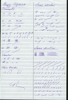
I hope it’s helpful.
Attachment: penmanship.pdf
Thanks. This is a good idea, and a helpful illustration. Personally, I don't think that d-t, b, and v have to be twice as tall as d, p, and f, respectively. I think if b goes up to the halfway point between the top of p and the upper line it would be more convenient.
On a similar "note" (pun not intended, but enjoyed) I came across this video of someone writing Taquigrafia Gregg, and the writer is using small scale graph paper, which works as a proportion guide.
shorthand writer using graph paper
This looks helpful to have the extra lines. I made regular Gregg Ruled paper (since I cannot find any stores in my area that carry Gregg pads). I'll start another topic and attach it in case anyone is looking for just "regular ruled" Gregg paper.
Around here, normal steno pads are Gregg ruled, but they aren't called Gregg. It's 1/3 inch.
Nevermind. I see no way to attach .pdf or Word documents to posts 🙁
Although you cannot attach documents, you can create a link to documents stored in your Google drive.
Ok, I'll try and figure that out tomorrow since my Word document is saved on my desktop computer (I'm on my laptop ATM).
Why haven't I noticed this before? This is great. Thanks!
You're welcome!
Regarding the proportion of "A". According to the rule it seems that A is supposed to occupy 1/2 the space of the line, but I haven't observed this to be the case much (in the manual or sample writing like that above). My own A's are smaller as well. Does anyone here follow this size rule? I feel as though I should correct this in my writing, but it seems so awkward to make it so large.
The half-space suggestion is just that, a suggestion, and it applies only when the a circle is written by itself, not when it is connected. (I think I write it in about 1/3 of the space instead of 1/2, thinking about it.) The purpose is to make sure that you can distinguish it from the e circle. The important thing is to make the a circle big and the e circle very small so that you don't have to guess which one is which in rapid writing.
If you follow the sizes of the circle vowels "A" and "E" as shown in the reading and writing practices of both the Anniversary and Simplified Manuals, you should have no problem transcribing what you've written. Truthfully thinking back in shorthand classes I have no recollection of a statement regarding the percentage of space the circles should occupy between the upper and lower line of a Gregg-ruled shorthand pad. We were frequently introduced to new vocabulary by examples written on the blackboard. It does seem odd to me that when writing one would pause long enough to think an "A" should occupy half the space of the line rather than simply automatically writing in the proportions you've seen in the texts.
I am finding it VERY VERY hard to keep my proportions correct. This is probably the hardest thing for me as a beginner writer following the functional method.
Proportions will come with practice. It takes time.
Even if you only get the proportions of the first letter right consistently you will have more information to decipher the word than you would, say, using teeline shorthand.
Although my elementary school classes were taught in a more modern building than "the little red schoolhouse", I do recollect that we were taught (and graded) on writing cursive script … in other words, we were expected to have good handwriting by both teachers and parents. Perhaps being forced to emulate the formation of the alphabet and following examples of handwritten text aided our generation to act similarly when writing Gregg shorthand. Looking back as well as I can remember what actually occurred in classes, our instructor always stressed "writing" and never uttered the word "draw". Perhaps my guess is not valid, but I'd suspect it's tougher to write proportionally correct shorthand from the get-go if the student had not been intensively drilled in writing cursive script in the formative years. Incidentally, today my handwriting is not nearly as beautiful as it was in 1960! LOL
Does anyone still have a copy of the penmanship.pdf? I cannot download it and i get no response from requesting access to it.
Pls email pdf or info to hbrhodes@gmail.com
Using 1929 ann ed
Have you registered to use and access the documents of the blog? Send a request clicking on About, Contact.
This, to me, is VERY helpful. I learned Japanese Kana, which is proportional. What I've been struggling with is figuring out how to do the proportions for Gregg. Having a good example is very beneficial.
Thanks for this, Carlos! Previously I had been using 5 mm dot grid paper to help with my proportions. It was making me write bigger (since effectively I was writing three Gregg lines per 1 3/16"), and I had been misinterpreting some of the proportions by attempting to make things line up with the dot grid. Your template helped me to make my own A5 Gregg-ruled penmanship template.
You're welcome! I'm glad it helps.
I still can't figure out the rules for size of vertical strokes when beside a loop.
How would you read the bottom right, the TA and SHA lines?
I'm not sure what you mean: the difference between the "T" and the "SH" is in the incline. And of course, with "T", you begin the stroke on the line and you go up while with "SH", you begin the stroke above the line and you end on the line.
Those are not loops, but circles. For the sh, I just wrote them in the opposite direction (omission of r). But it really doesn't matter. The point I wanted to make was that you could write the straight stroke a little longer to accommodate the circle. (Actually, if there is a circle after a t or an sh, I still write the consonants very small.)