A little something to share. Transcription at the bottom!
Transcription
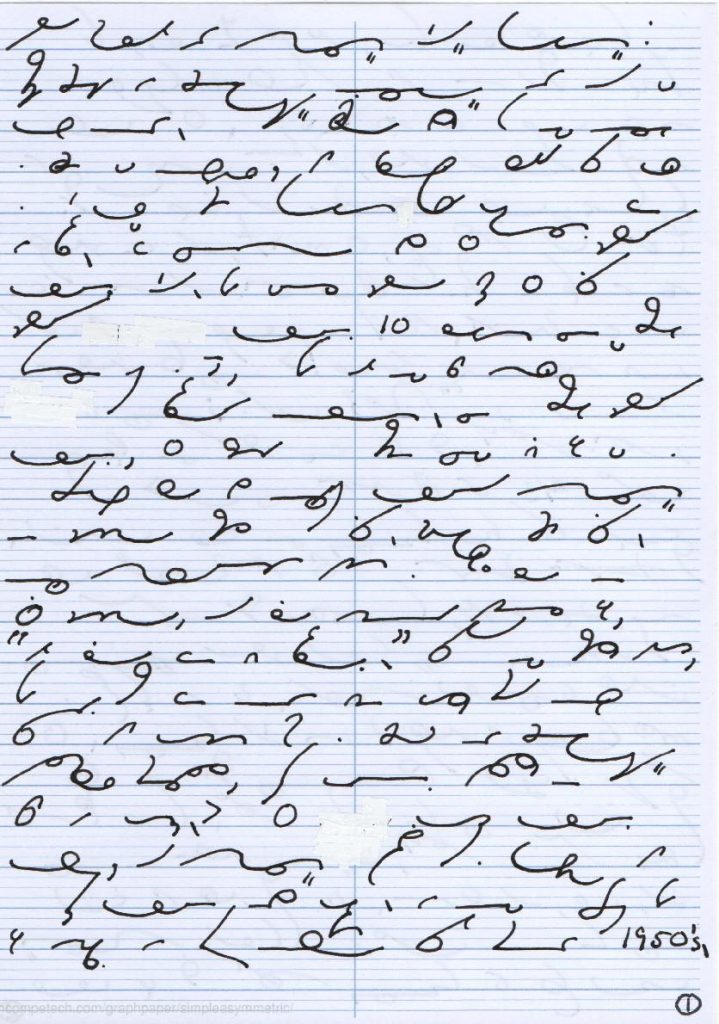
Dear friends at the Gregg Shorthand Blog: I just finished the Simplified Manual at the end of last month. While that is by no means a sign of mastery, to celebrate I thought I would write a short letter for the blog reflecting on the experience. Over all I am glad that I started learning short hand. Part of me still wishes I had started learning 10 years ago when I first began to have interest, but there is no use crying over spilt milk. When I first started learning, I asked everyone I knew who was of a generation where they might have learned Gregg in school if they had. Surprisingly few had. My grandmother took a year in high school, and her comment to me was, “It’s hell on your spelling.” I don’t know if that’s true, but I have on more than one occasion found myself attempting to look up a word in the Simplified dictionary phonetically, before remembering that that is not how it works.
I love learning languages, and Gregg has been a pleasure to learn in that respect. The most painful part was copying the junk mail ads from the 1950’s. Not because they were boring, though they often were, but because I found them to display a profoundly crass level of commercialism. I liked the fables, stories, and a couple of the business letters regarding fair and honest advertising (what happened to that concept, I wonder?), and on striving to see the best in everyone while acknowledging and working on our own faults. It was such a relief to be able to read some [of] Carlos’ transcriptions!
My strength at this moment is definitely reading; my weakness is taking dictation, as I only started when I was 2/3 of the way through the manual.
I have always had poor penmanship when writing longhand. I have forgotten how to fluently write cursive, since it stopped being required after middle school. My printing still resembles my handwriting circa third grade. So it has been an worthwhile challenge to strive for good shorthand penmanship. I discovered recently that in my efforts to be precise I have been holding my pen very tightly. It gets worse during dictation, resulting in strain in my hand, wrist, and arm. So I have been try[ing] to hold my pen more lightly. Printing Gregg ruled paper with penmanship guides has [also] really helped my proportions and alignment. Though as you will have noticed reading this letter, I tend to scrunch my outlines together.
I am now eager to start Anniversary. Originally I thought I would prefer to write things out more, but in practice I find myself wishing I could abbreviate more. Therefore my next steps will be learning Anniversary and focusing on dictation. Thank you all for all the support in the form of materials, questions, and discussion! Very truly yours, Plays With Pens
* anything in [] is a correction of a typo in the shorthand text.

“Letter Celebrating Finishing Gregg Simplified Manual” by Plays_With_Pens is licensed under a Creative Commons Attribution-ShareAlike 4.0 International License.
What a fantastic post! Congratulations on finishing the Simplified manual! I have no doubts you will breeze through Anniversary.
Wow, congratulations! This is great! And your penmanship reads nice and clear to me.
Hey, I noticed you use the graph paper from Incomptech. Can you tell me what your settings (horizontal and vertical grid spacings) were for your Gregg guidelines?
Thanks Carlos and Washbear! I'm looking forward to Anniversary. I've started reading through lessons, but haven't gotten to writing any drills yet.
Washbear, here are the settings I used for the Gregg guidelines over at Incomptech's simple asymetric graph generator:
– A4 landscape (29.7 x 21 cm)
– Grid line weight normal: .15
– Grid line weight bold: .7
– Horizontal size: 7.425 cm
– Bold every 1 line
This creates four columns on an A4 landscape page, so when I cut the paper down to portrait A5, I get the two steno columns that are a little under three inches. It was mainly an experiment. I find the columns rather cramped, so I'm not sure if I'll continue using them. If you're using different paper dimensions, you can play around with values.
– Vertical size: .209 cm
– Bold every 4 lines
Had to monkey with this for a while, but .209 cm vertical spacing will give you 4 lighter penmanship guidelines per bolder writing line, and 3 writing lines per inch. The grid line weight might throw this off by fractions of a mm, but I think it's good enough.
– Color: Hex # b3b3b3
I like gray lines so they don't interfere with seeing black ink. I might even make it lighter next time.
Fantastic! Thank you so much!
Excellent! I am really impressed! Easy to read.
I learned on Simplified many long years ago, but my teacher, an older fellow, who was one of the first court reporters in Congress, encouraged me to learn Anniversary, and, if I were really serious, pre-Anniversary, for the higher speed and efficiency. He was right! The memory load is heavier, but well worth it to take fast, comprehensive notes.
You're off to a great start! I hope you will continue, as I think you will find it very rewarding. Although I have been retired for several years (former journalist), I still write shorthand all the time. It's like second nature.
@Washbear – Hope it's useful. 🙂
@Wordsmith – Thanks! I've started the Anniversary Manual, though I don't have as much time for it as I'd like. I've ordered a reproduction of the 1916 Manual for reference and curiosity.